One simple definition of typography is "the practical and artistic arrangement of type and printing with type". So, I thought it would be fun challenge to make a project that uses words, text or type in a practical & creative way. So....this is what I made...
(click on the pic for a bigger version)
My starting point was to use one of the quotes or sayings from the Feel Goods stamp set. I love both the sayings, font choice & layout, so it was perfect for the challenge. Reading the sunshine quote gave me an idea to cut a sunburst background using the text paper in our new 12x12 paper stacks & my card came together from there.I heat embossed the sentiment with versamark & white embossing powder on so saffron card, cut it out with an oval framelit & added a little so saffron sponging to help make the sentiment pop. Then I mounted it onto some vellum card & pierced a border. You can see the glossy image better in this pic.
Once I'd pieced the background & added the sentiment panel (popped on dimensionals), I wanted to add a final little touch so I added some tiny gold embossed butterflies from Papillion Potpourri
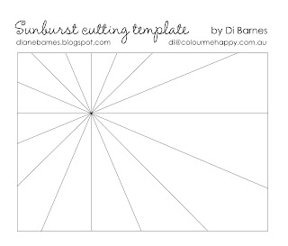
Sunburst background template
The sunburst background with text paper enhances the typography theme. I could have made the background using the sunburst template & instructions I shared in this post. However, as I wanted the text on the paper to remain horizontal, I drew up a paper template using the same process. I used this template to cut out the so saffron card & DSP together so the pieces would be exactly the same size. Keep them all aligned so you know how they go back together. I sponged each piece lightly with so saffron ink to add a little more depth.
From this point, the actual sunburst piecing is the same as described before so see these instructions.
Alternate glueing a piece of card, then a piece of dsp onto a thin backing sheet of scrap paper until you have completed your sunburst. You'll be able to make two full sunbursts.
I mounted the sunburst background onto some soft suede (which played beautifully with the so saffron - who knew) & a so saffron base.
Good news - I've drawn up a template for you to save you time & effort. Just save the image below & print it. The actual template should print at 10.5 x 14.8cm (a quarter A4 sheet, ie normal card front)... hopefully if your computer is behaving.
Tip: If you want to make your pieces bigger, just extend each of the cutting lines, or enlarge it when printing.
A request: please link back to this post rather than posting the template image pic on your own site, so others can see the original inspiration. You're also welcome & encouraged to pin it so you can find it later too. Thanks
Alternative gold version
I also tried using a gold sentiment on the card, but I liked how the original white embossed version worked so nicely with the white text, more. I thought I'd share it here anyway & you can make up your own mind.
So, that's my take on Just Add Typography. Now check out what the whole design team made too & I'd love you to try the challenge too.
Thanks for visiting today & I hope you're inspired to have a play with some words or type of your own. Leave me a comment if you liked my card or if you'd like more info on anything. Remember to pin it for later too.
Until next time, sending you some inky wishes,
Di
Supplies
To see & order any items used in today's project, just click on the items below to see them in my Online Store. You can order from me if you live anywhere in Australia. I would love to be your Demonstrator if you don't already have one. Please allow "Demonstrator contact" in your preferences so I can thank you properly when you place your order.
Note - Stamp sets & bundles noted below may be available in other mount options (eg wood, cling rubber or photopolymer). I have listed the option that I used. Please check the online store if your preference is different.
.png)


8 comments:
Wow, what a stunning card, I love your take on this JAI challenge! Love the layout and colours too. Hugs Jo
Gorgeous cards! I've just printed the template as I've been wanting to try this technique for a while! (it's on a very long list of things to try) Thank you for sharing!
Oh-so-beautiful, Di! I, too, prefer the white embossed sentiment - but I do love the butterflies gold-embossed on So Saffron card. Love your creativity, my friend; very inspiring. xx
Di you are spot on with these fabulous cards! I love the thought you put into matching sentiment to sunburst and then ensuring you had all your text aligned.The gorgeously rich little butterflies are the perfect accent! xxx
These are both absolutely stunning Di! I love how you've matted the greetings on the vellum andI just adore your alternating card and DSP sunbursts! So reflective of the gorgeous sentiment too! x0
It's a stunning card Di! I love the colours and the layout - you can't beat a bit of sunshine in this world! Sherylee.
Your card is stunning, Di. Such an eye catcher. Love your attention to detail. Thanks for suggesting a challenge I really had to think about this week :) x
I love, love, love this Di! The DSP starburst is fantastic and it goes perfectly with the sentiment! Thanks for sharing the cutting template too! I've been meaning for a while now to give this a go. Thanks for sharing! Rochelle xo
Post a Comment